ProofScan App Design
Let’s Get Transparent.
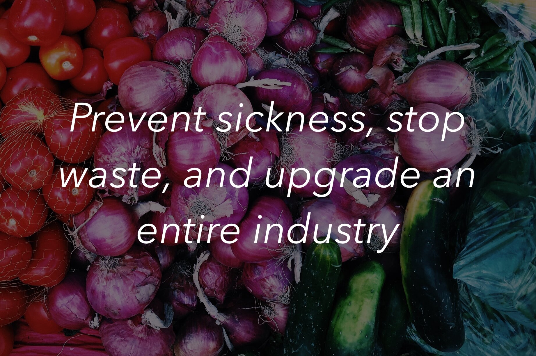
This was a client project in which I worked on a team of three UX designers and a UX researcher to create an app for a company called Transparent Path. Transparent Path is an impressively forward thinking company with the goal of providing food transparency to eliminate food fraud, reduce food waste, and prevent sickness. They plan to use IoT Smart Sensors to track food from the time it leaves the farm until it ends up at the retailer. The smart sensor data will be backed by blockchain to make this data reliable and trustworthy.
Clients:
Paulé Wood, Director of Design Experience for Transparent Path
Eric Weaver, CEO of Transparent Path
Team: Sarah Evans (UX designer), Dwight Stoddard (UX designer), Jeff Dinsmore (UX designer), Martina Dove, PhD. (UX researcher)
My Role + Process
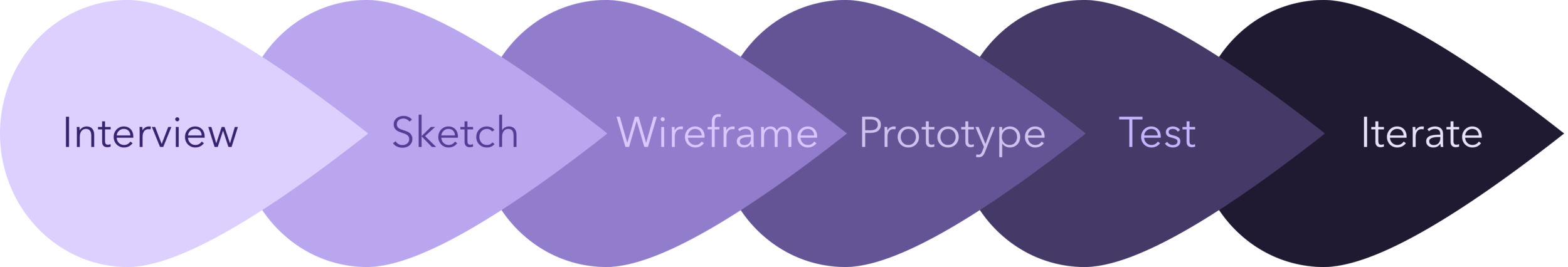
My primary role in this project was to design low to high fidelity wireframes and prototypes, but I also assisted with user interviews and usability testing.

Meet ProofScan.
We were tasked with creating an app called ProofScan that would be used to scan a QR code on a food item in the grocery store to access transparency data before purchasing the item.
In its early stages, ProofScan data will only be available for whole foods such as produce, meats, and dairy. The app will also have a producer view, but this project focused only on the consumer view.

The Vision
In this project I was lucky enough to work in a realm that combined three of my greatest passions: the environment, the welfare of humans, and food. Our client came to us with powerful technology, they just needed us to create an app to allow them to utilize it.
There was an opportunity to prevent sickness, minimize food waste, and improve the welfare of animals all as a result of creating food transparency.
This was important to me on a deeper level than practicing my craft as a UX designer because it allowed me to inspire systemic change in an industry that is only growing larger.
Transparency would give consumers the autonomy they seek
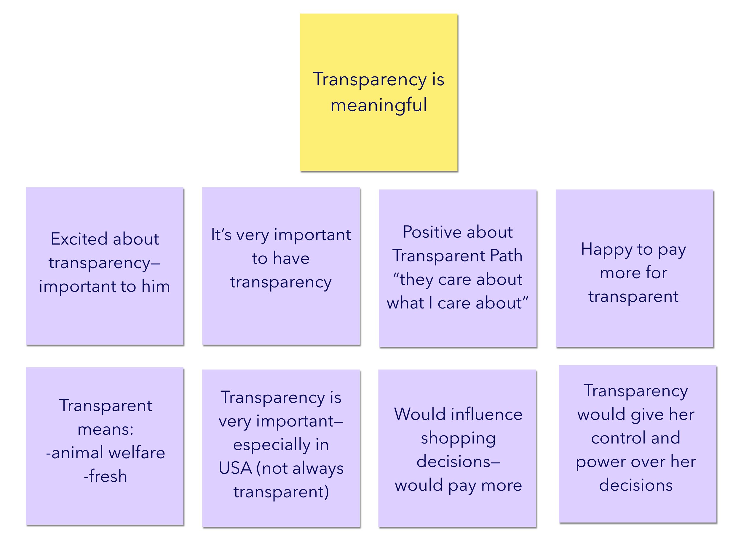
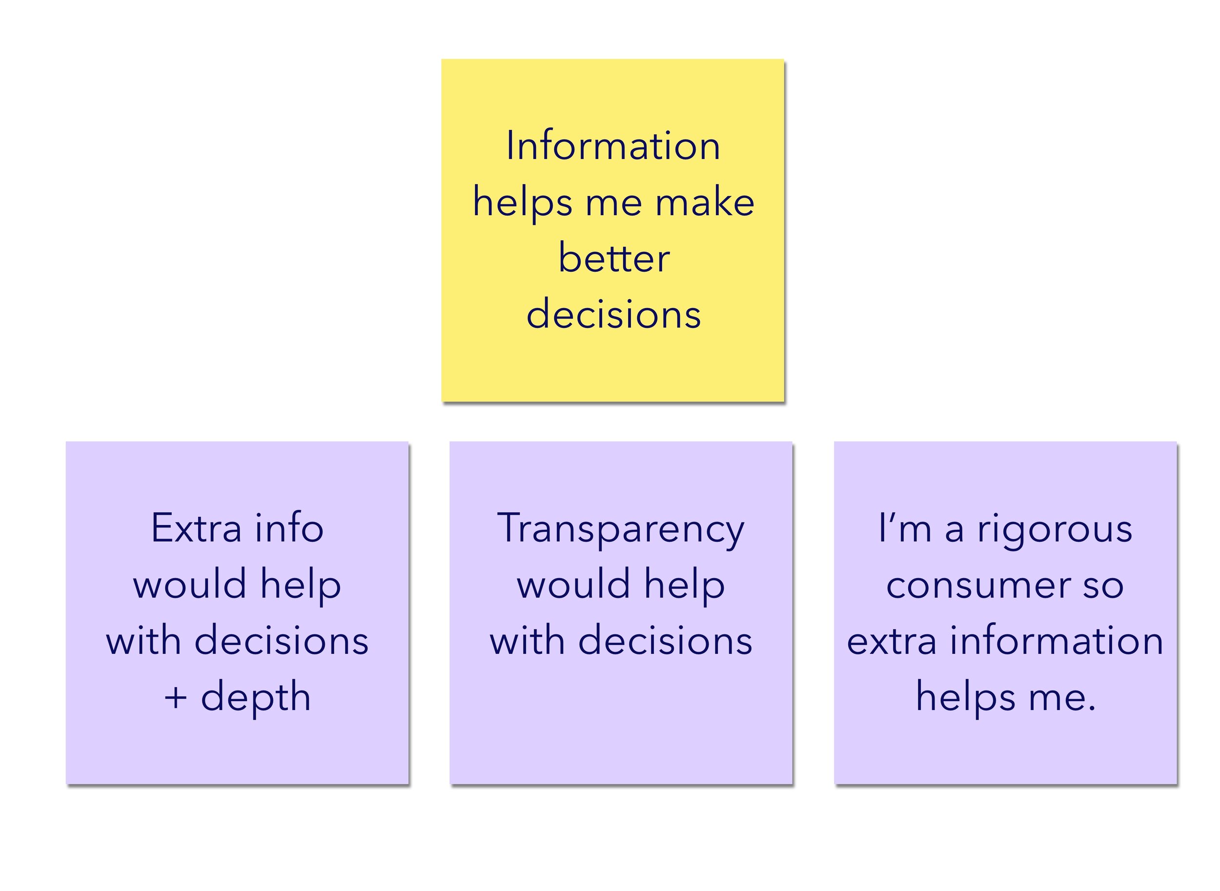
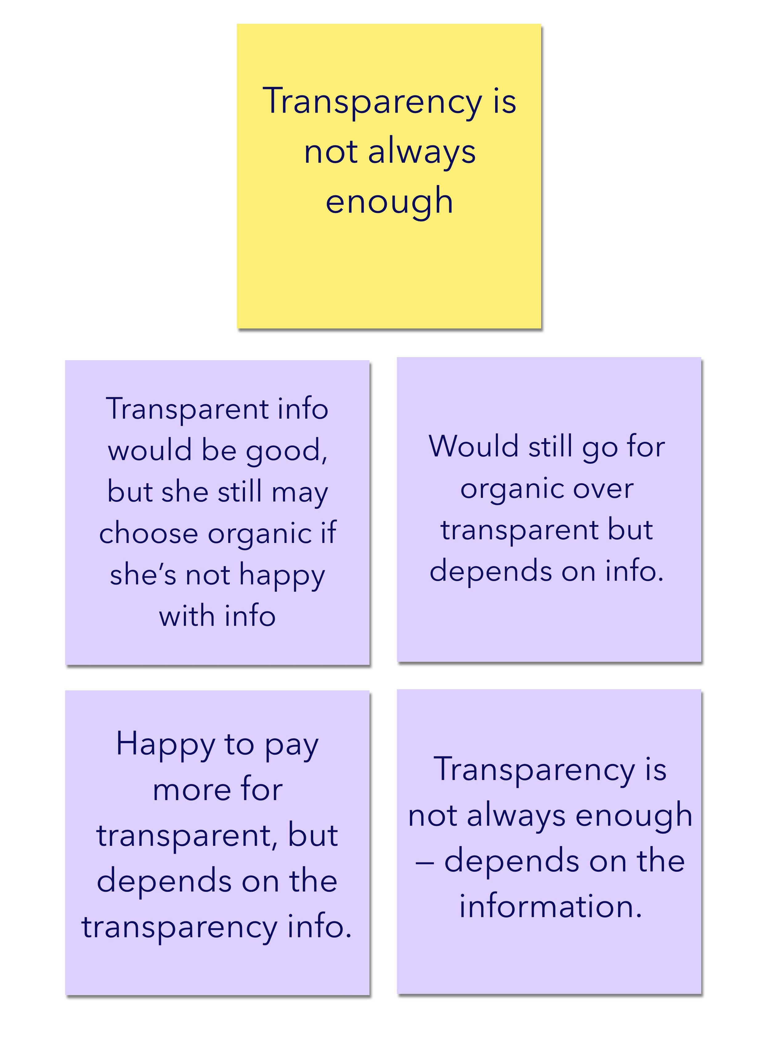
The first step in the creation of ProofScan was to do extensive research into the wants, needs, and expectations of the consumer. We performed user interviews and affinity mapped to synthesize our research. A selection of high level affinity groups can be seen below.
Our UX researcher led an exhaustive survey on food transparency and conducted more interviews, which resulted in a comprehensive 88 page research report on the consumer view of food transparency.
Some high level insights from the interviews and survey were:
Transparency is meaningful to consumers
Information helps me make better decisions
Transparency isn’t always enough
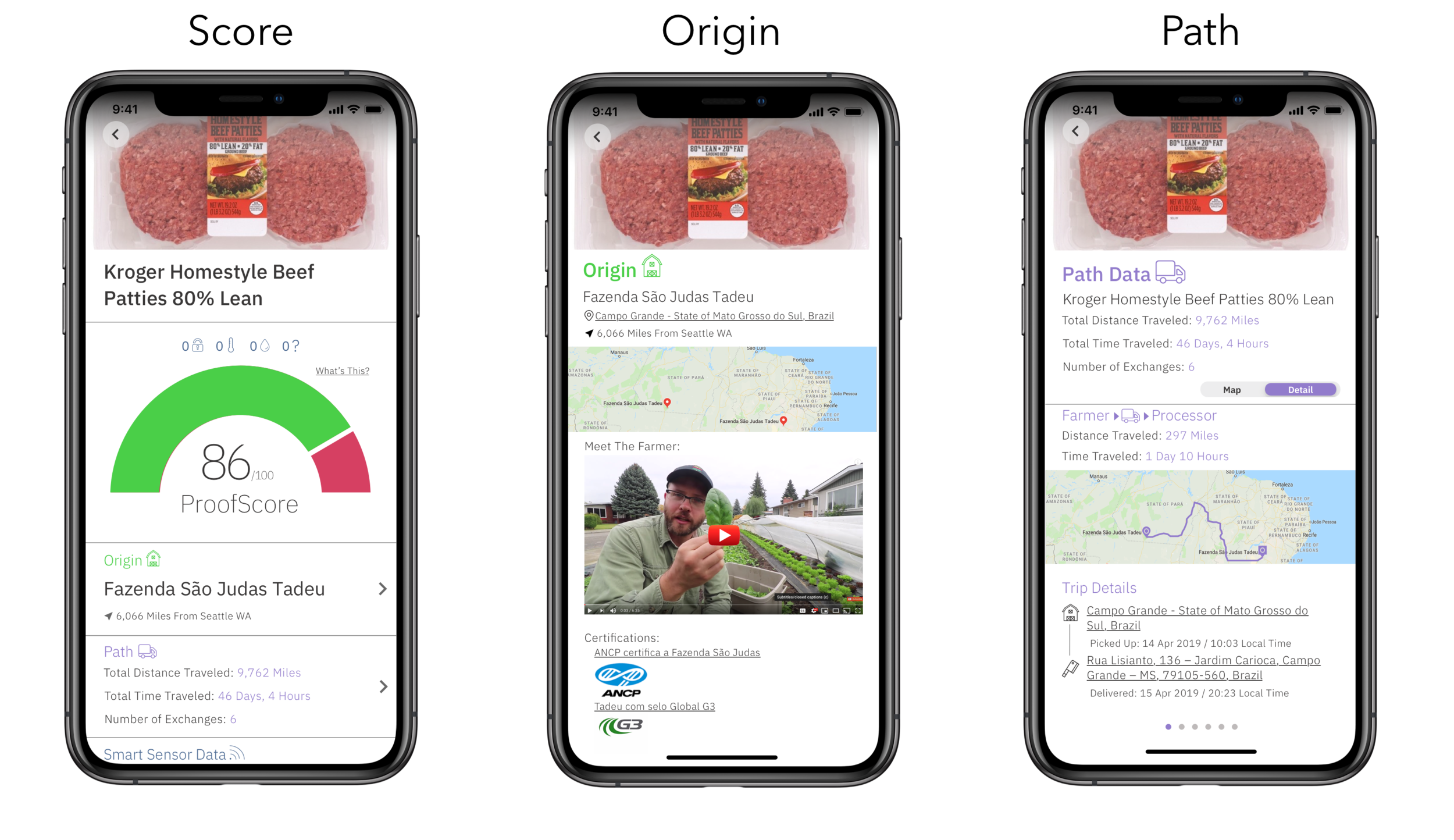
Origin + Path + Score, oh my!
Research yielded valuable insights that we were able to take into the building phase. These are the final iterations of the three core screens of the app where the key food transparency information lives. Now let’s talk about how we got there.
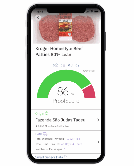
How did we show the “ProofScore”?
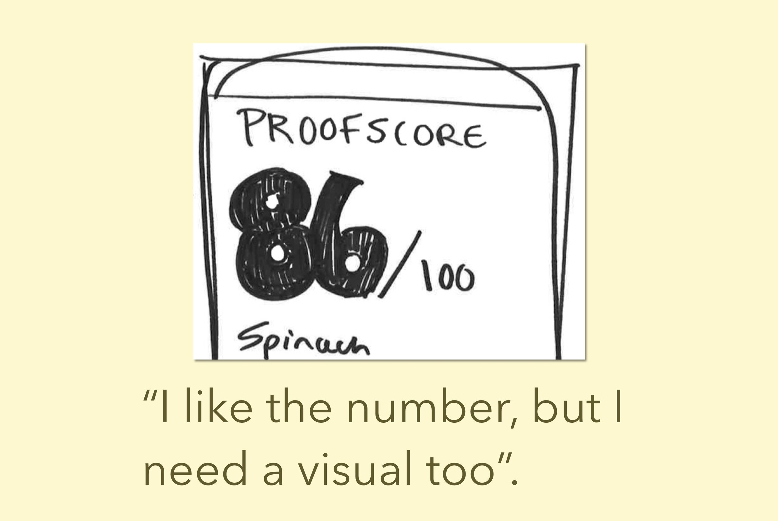
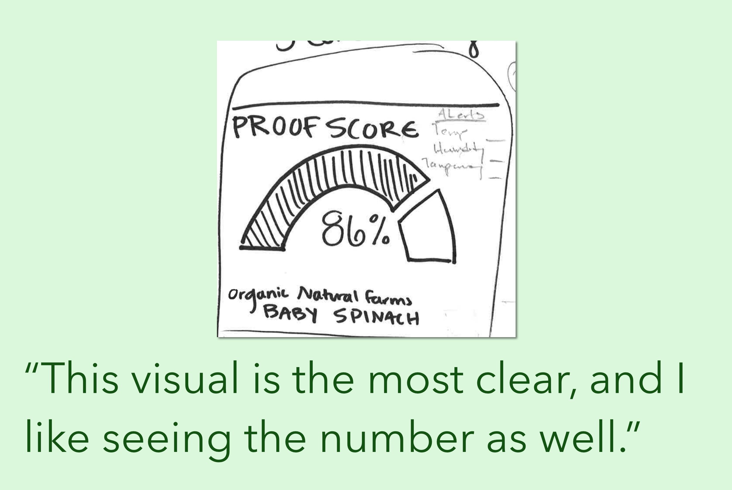
We also needed to figure out the “ProofScore”; the transparency score that users would see after they scanned an item. What would it look like? What information would be included? Does the score only reflect transparency or do we include other factors? What might those factors be? This proved to be a difficult task. I sketched up 5 versions of the ProofScore page and we tested these with users. The score pages can be seen below with quotes from our participants.
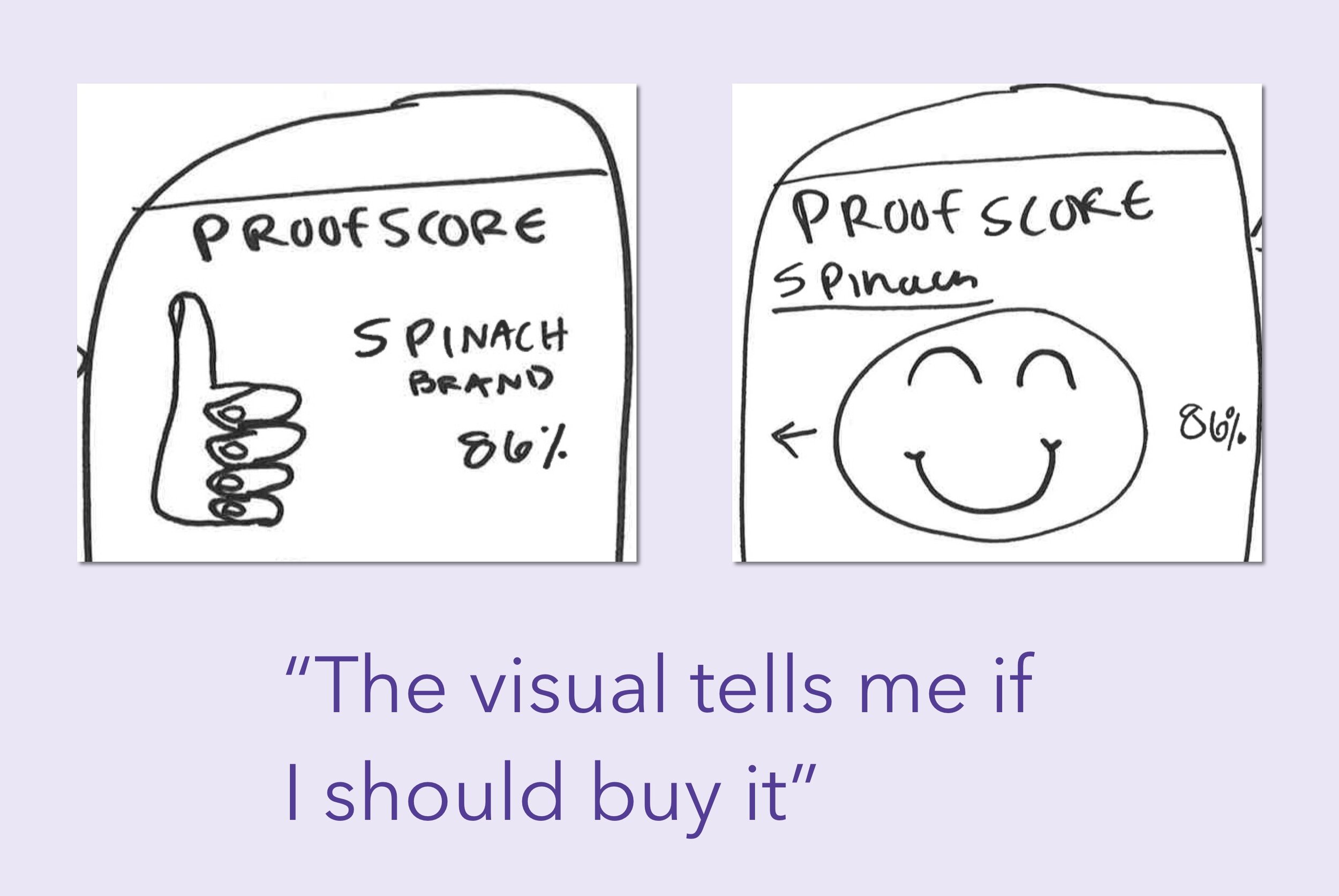
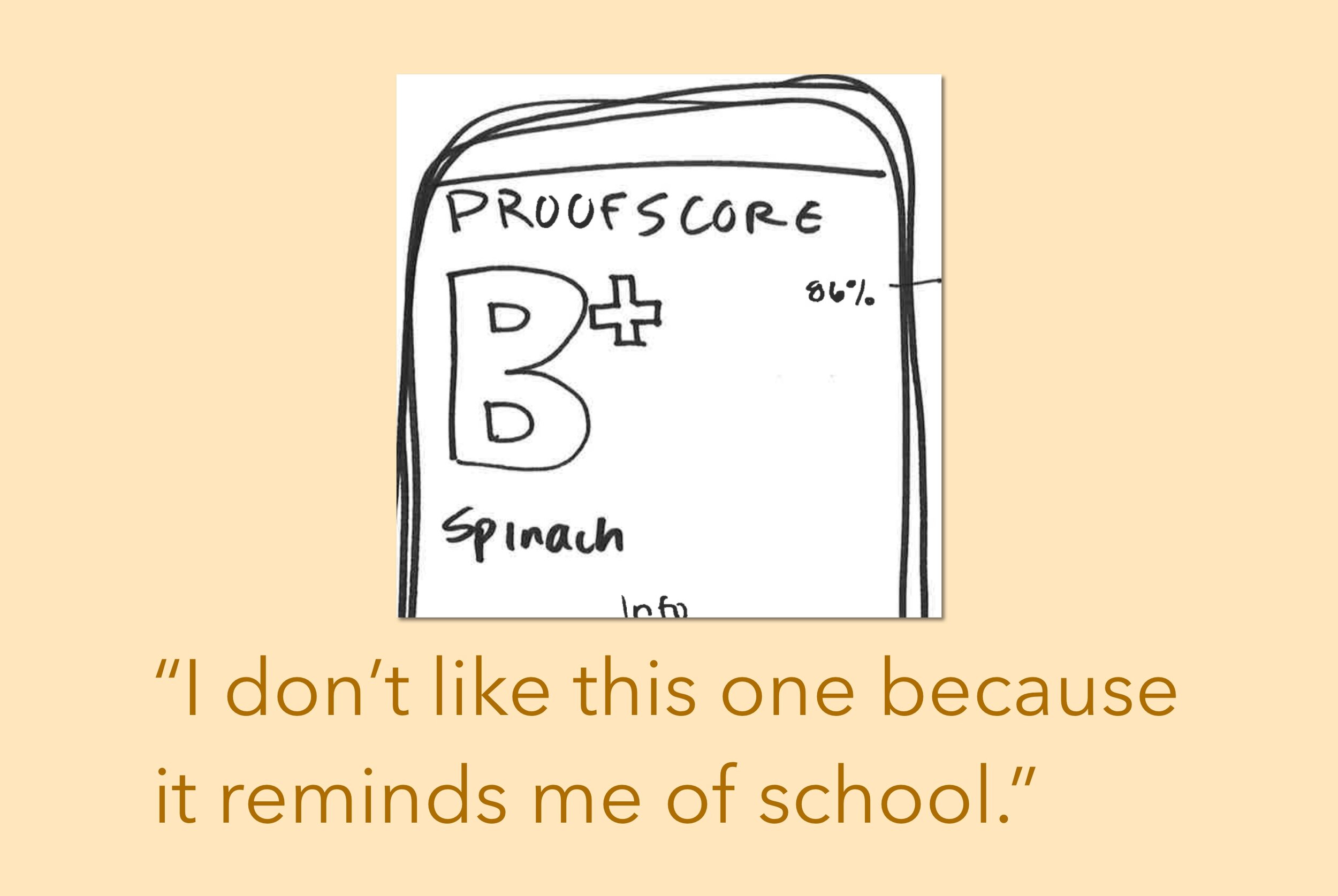
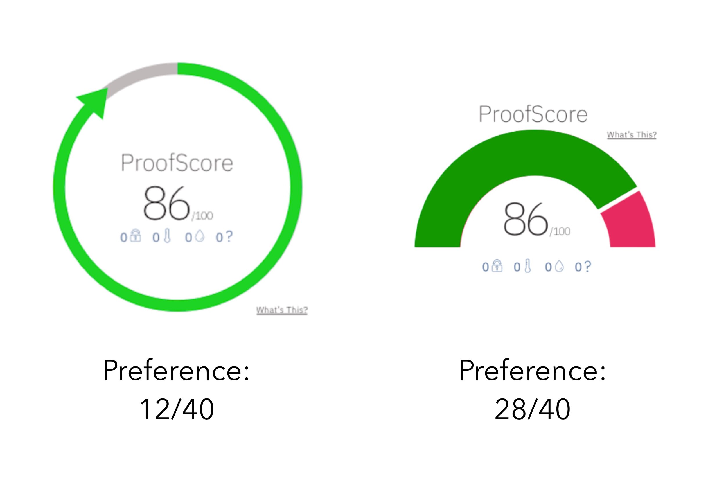
Fuel gauge wins!
The clear winner for the score sketches was the fuel gauge style score with the number below, with 50% of the users tested picking that variant as their favorite. With this data, we mocked up two score variations to do a preference test. Yet again, the fuel gauge variant came out on top.
Origins + Path Screens
The purpose of the origins page was to facilitate a deeper connection with the farm that feeds you. it was important to include the “origins” page where users could see where their product originated from and read some information about the farm and the farmer.
The purpose of the Path page was to enable users to know more about what happens to their food before they buy it. The “path” page shows the entire path the product took from the farm to the retailer, with each stop along the way. I drew some versions of these pages which we then turned into wireframes.
Let’s start with Origins.
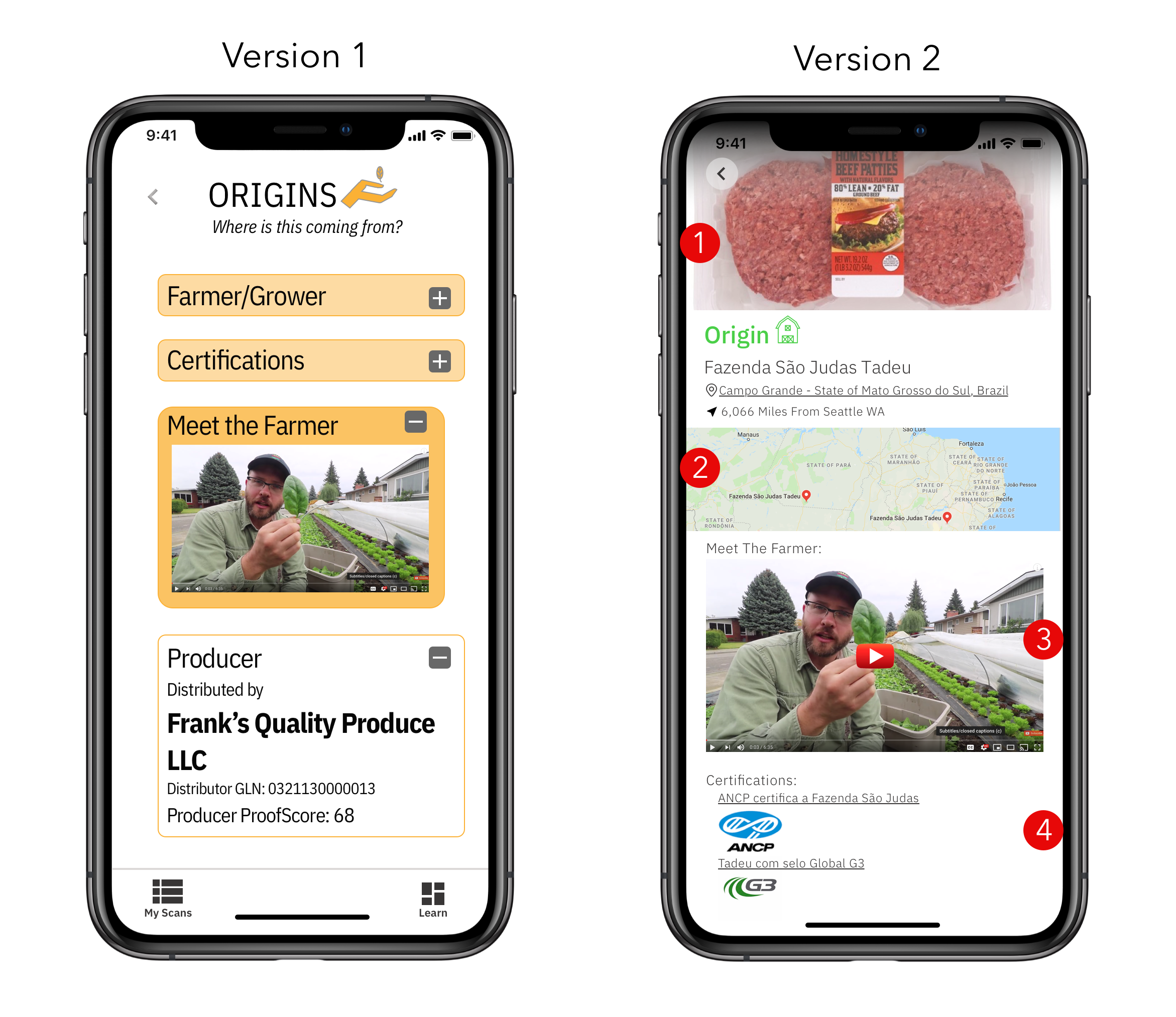
The major change to Version 2 was putting all of the information on one page. Additional changes:
Hero image of item scanned to let user confirm item scanned
Map of where farm is + how many miles from retailer it is to let the user gauge the distance traveled
“Meet the Farmer” section is larger to ensure users don’t miss this section
Certifications at the bottom with links + icons to give the farm credibility
Origins dive
Once the user opens the Origins section from the ProofScore screen, they will see:
- Origin location with map
- A “Meet the Farmer” section with information + possibly videos from the farm
- Farmer certifications
Now let’s take a look at Path.
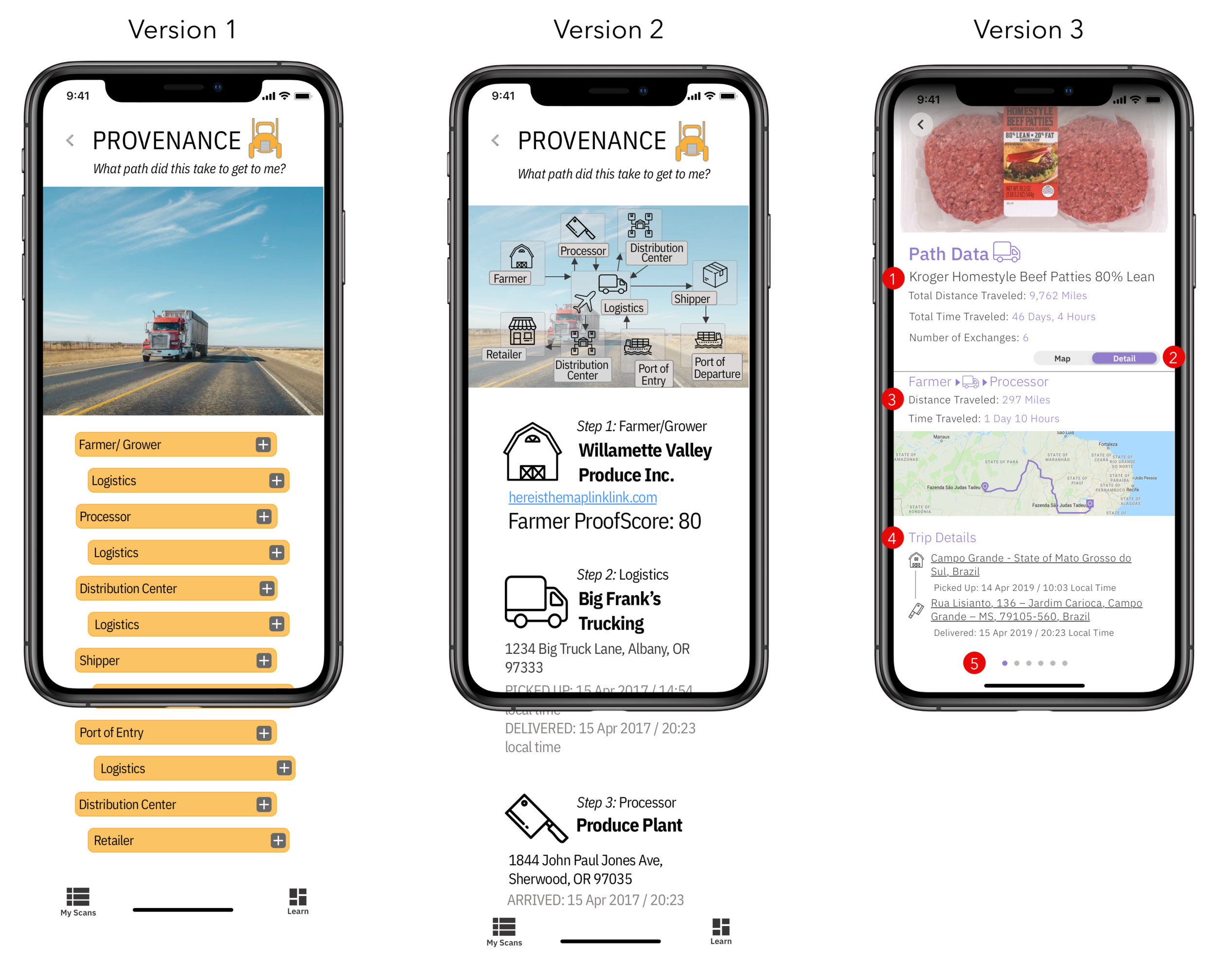
The major challenge we faced here: SO. MUCH. DATA. We knew we needed to include all the stops the product took along the way, but we weren’t initially sure how to do so in a digestible way.
We decided to put the stops the product took in a carousel to decongest the page. Other changes:
Put the “spark notes” information at the top as a summary for users who don’t want to take a deep dive
Included a map view + a detail view: map shows the whole path, detail shows each stop along the way
Within detail view, showed distance + time traveled during each leg to give users a sense of how much time was spent on each trip
Included trip details to provide a deeper level of information on each leg traveled
Again, put all of this information in a carousel to improve hierarchy within each page
Bonus: We decided to change the name of this section from “Provenance” to “Path” because nearly all of our users tested didn’t know what the work provenance meant.

Just keep swiping.
In the final version of the Path screens, users can swipe through the carousel of path data to see the distance and time their product traveled between stops.
PRO TIP: Watch the purple line on the map to see the product’s journey.
Woah. That was a lot.
I know. Let’s break it down.
Things we changed— Origins
Freed up space
Put everything on one page so users wouldn’t have to open every tab to view information
Added a map
Things we changed— Path
The name!
Moved from a list view to a carousel format
Added a map with a path that changes location in each screen
A little somethin’ extra
My Scans + Learn
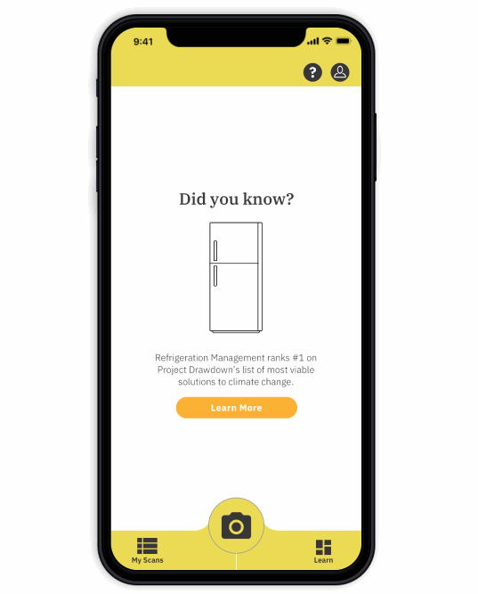
Once our core pages were figured out, we wanted to include two more pages we thought would be useful to consumers. First, a “my scans” page where users could easily go back and view their past scans for reference, and to compare scores of products.
We also created “Learn” page. The motivation for the Learn page came from our user interviews where we found that when we gave users even the tiniest bit of information into food transparency and its associated benefits, people wanted to know more. The purpose of this page was to give users more information on transparency, sustainable practices, recall and contamination alerts, and more in a digestible way that users could click into if they chose to.
Producers, you’re up!
We performed valuable research and design work for the consumer facing side of ProofScan. However, due to the very short (3 week) duration of this project, we were not able to tackle the producer facing side. Having the producers on board is a vital component of this app, so during our handoff to the client we expressed that a clear next step for ProofScan is to tackle the producer facing side of this app, beginning with producer research. I fully believe this app will be successful once producers are on board because in our research we found that consumers were willing to pay more for transparency data, meaning that the producers will have a financial incentive to join. We were successful in developing the consumer facing side of this app and were grateful to have worked with Transparent Path.
Next project: HomeLearning app design